
GovFeeds just got smarter: Now you can see what's actually working
GovFeeds now includes engagement metrics throughout the platform. You can see not just the messages, but how people are responding to them.
12/8/20254 min read


For the past year, GovFeeds has been helping public communicators answer one question: "What are governments like mine saying on social media?"
You've been using it to search thousands of posts from official accounts—filtering by state, city, county, date, keywords, whatever you need. It's a quick way to find examples, compare messaging, and see how your peers are handling everything from snow emergencies to budget announcements.
But we kept hearing the same follow-up question:
"Okay, this is great for seeing what people are saying. But can you show us what's actually working?"
Today, the answer is yes.
GovFeeds now includes engagement metrics throughout the platform. You can see not just the messages, but how people are responding to them.
Quick refresher: what GovFeeds does
GovFeeds pulls public posts from official local government accounts and makes them searchable by location, date, and keywords. You can browse posts from peers across the country and filter down to specific topics, agencies, or jurisdictions.
It's built for public information officers, communications teams, social media managers, elected officials and their staff—anyone whose job involves figuring out "What should we say about this?" or "How are other governments handling this?"
What's new: engagement data, built in
Here's what you can do:
Search and sort by engagement. Filter or order posts by total engagement, or break it down by likes, comments, or shares. Surface the top-performing posts on any topic fast.
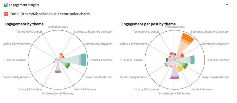
See engagement by theme. New polar charts show which content themes drive the most interaction—things like "Events & Community Activities" or "Public Safety." A second view shows engagement per post by theme, so you can spot where you're over- or under-performing relative to how often you post.
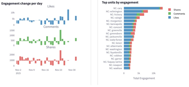
Track engagement over time. Time-series charts show daily changes in likes, comments, and shares. See spikes during campaigns, storms, or big announcements.
Benchmark against other jurisdictions. A "top units by engagement" view ranks cities and counties by overall engagement. It's a quick way to see who's punching above their weight—and worth learning from.
The short version: GovFeeds now gives you both the content and the context.

Why this matters
Engagement metrics aren't just a vanity scoreboard. Used thoughtfully, they help you:
1. Plan smarter content
Those polar charts show you, at a glance, where residents are already engaged and where you might be missing opportunities. Maybe "Events & Community Activities" gets tons of interaction, but you rarely post about "Health & Wellness"—even though when you do, engagement is strong.
You can adjust your content calendar to match what people actually respond to, spot gaps, and make better decisions when you're stretched thin.
2. Benchmark against peers
The "top units by engagement" view shows how your city or county stacks up. You might notice a neighboring town consistently gets more shares on public safety posts, or a similar-size city gets high comment volume on economic development.
From there, you can click into those jurisdictions, read their posts, and figure out what they're doing differently—tone, timing, imagery, calls to action—without just guessing.
3. Evaluate campaigns and crises in real time
The engagement-over-time chart breaks out likes, comments, and shares across whatever window you're looking at. See whether a new approach is working, understand how a severe weather event or policy decision affected engagement, and separate one-off viral moments from steady interaction.
And because GovFeeds sits on top of real posts, you can go from the chart straight to the actual messages that drove those spikes.
What this looks like in practice
A few scenarios we built this for:
Planning a campaign: You're launching a pedestrian safety campaign. You filter for similar campaigns in other cities, sort by shares to see which posts people felt compelled to pass along, and borrow language that's proven to work.
Reporting to leadership: Your city manager asks, "How are we doing on social media compared to others?" You pull a GovFeeds snapshot comparing your engagement to peers and show where you're leading, lagging, or trying new things.
Learning from what worked elsewhere: A neighboring county just handled a snow emergency you might face next week. You search their posts, look at which ones drove spikes in comments and shares, and adapt the clearest language to your own context.
This exists because you asked for it
Clients told us: "We love seeing what others are posting, but we need to know what's resonating." "My leadership wants numbers, not just examples." "I want to spend less time screenshotting and more time learning."
So we listened. These engagement views are our first big step toward making GovFeeds not just a library of posts, but a working lab for what actually works in public-sector communication.
How to start using it
If you're already a GovFeeds client, just log in. Apply your usual filters, then open the new Engagement Insights section to explore the charts and start sorting posts by engagement.
If you're not using GovFeeds yet and want to see how governments like yours are communicating—and what's landing with residents—sign up for a free trial here!
GovFeeds is built on a simple belief: public communicators shouldn't have to reinvent the wheel every time they post. With engagement metrics now built in, you can see not only how others are talking, but what their communities are talking back to.